An appointment platform to schedule COVID-19 tests and vaccines through the US pharmacy community
Client
Prescryptive Health
Role
UX designer
Project duration
5 months
(Oct 2020 – Mar 2021)
During the emergence of COVID-19, visiting healthcare facilities in person could expose healthy individuals to the virus. In response to this challenge, Prescryptive Health, a tech company founded in 2017, created an appointment platform facilitating the scheduling COVID-19 tests and vaccines for individuals through the US pharmacy community. It was publicly launched in December 2020 in the New York state.
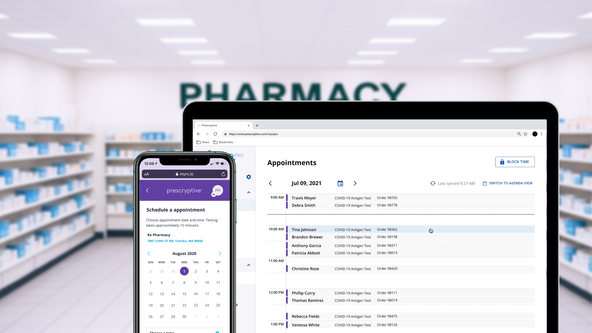
The myRx platform
The solution was a dual-platform ecosystem designed for speed and scalability, built to integrate seamlessly and manage the full appointment lifecycle for high-volume public health services.

Mobile app
for patients
Allowed patients to book COVID-19 tests and vaccine shots. Patients could also buy other services as well.

The web platform
for pharmacies
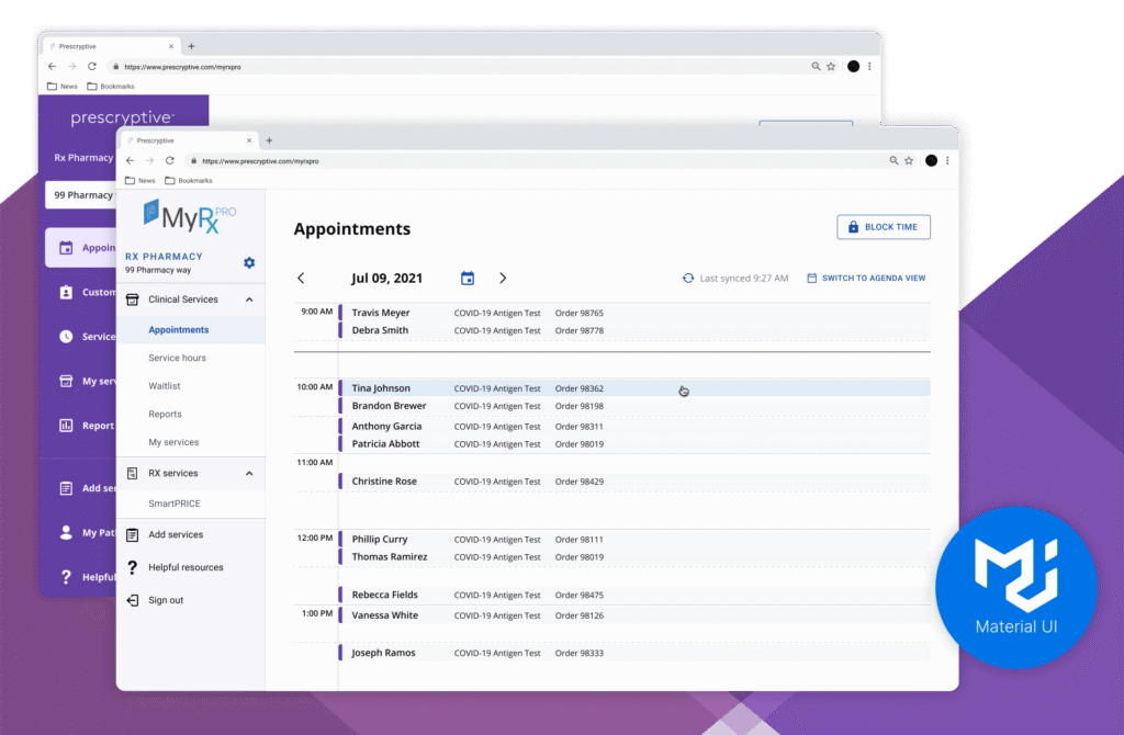
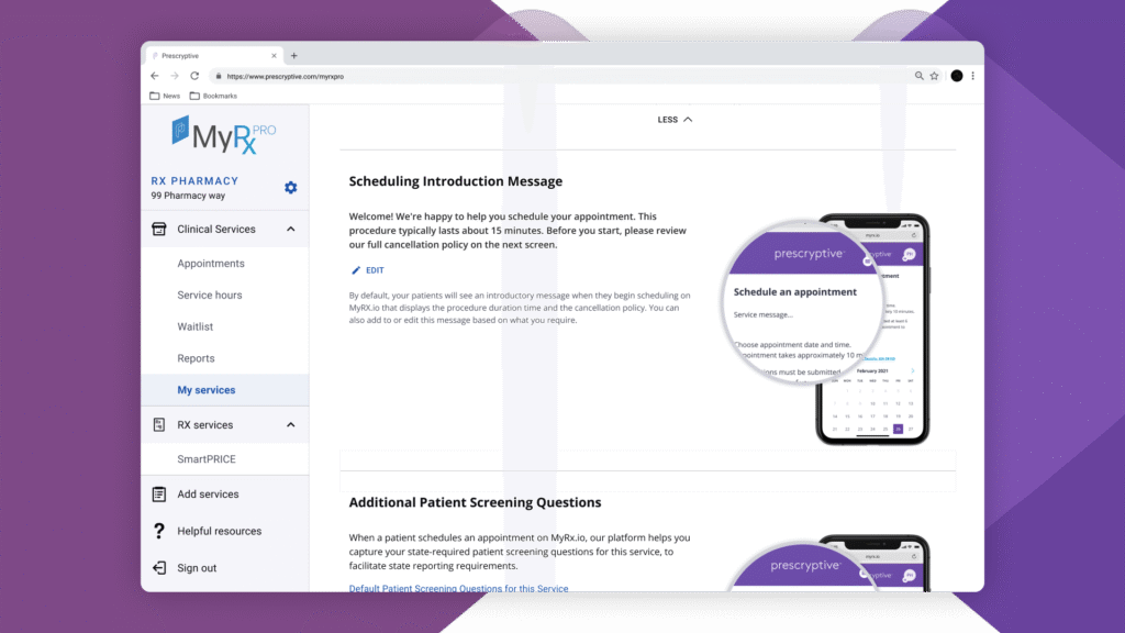
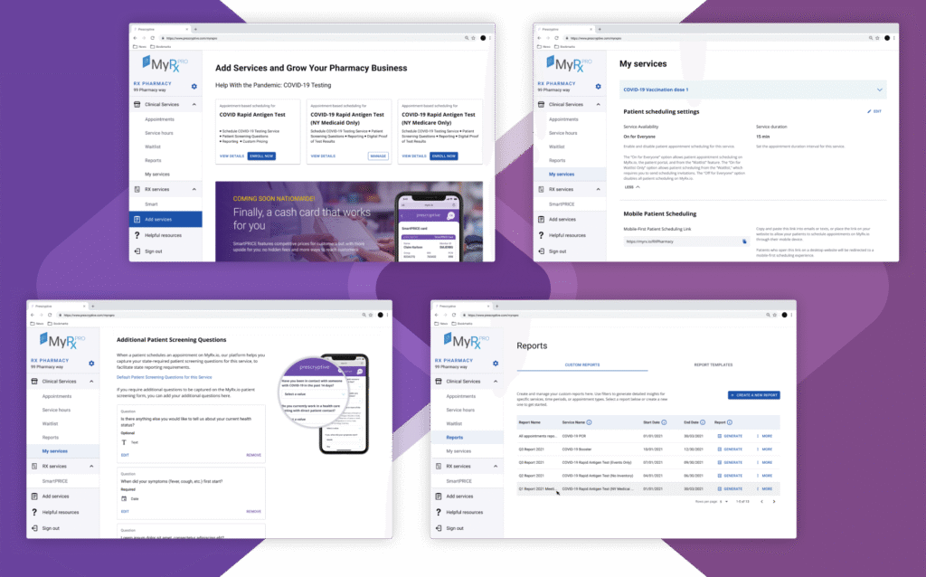
Allowed pharmacies to manage appointments, check patients’ information, record procedures, and send reports to state health departments.
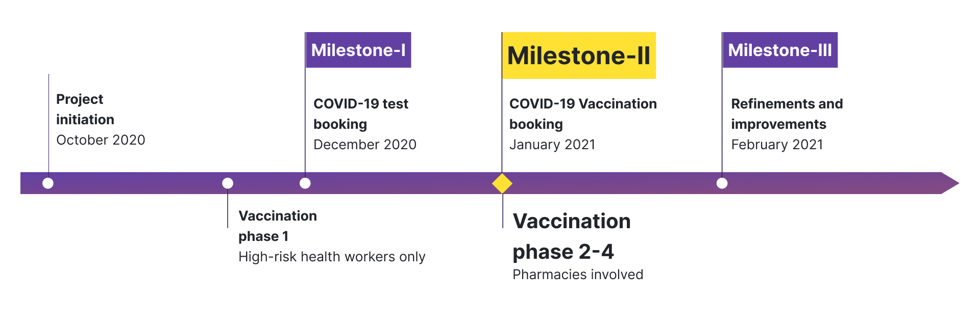
Adapting to the emergency
Project timeline
Due to the emergency, time became an important element in the project’s development. Once the he US announced that the COVID-19 vaccines started national-wide started in January 2021, the team aimed to focused in syncing with the phase 2 of the vaccination campaign.
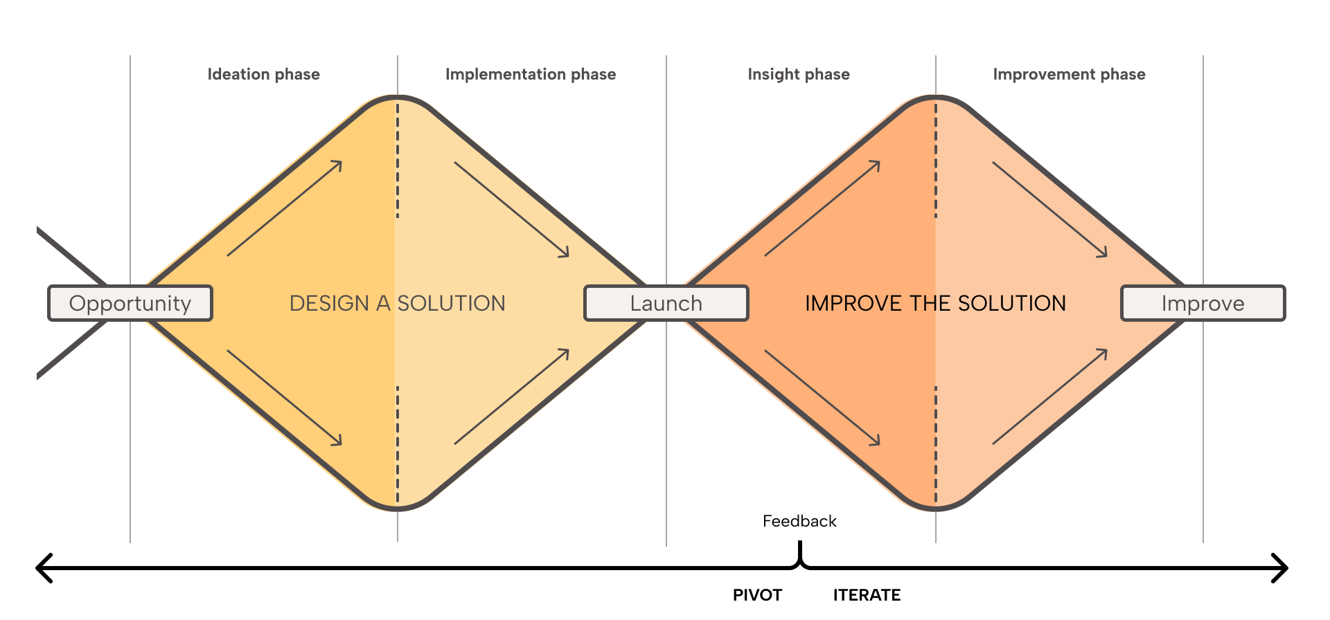
The reverse double diamond approach
Instead of following an ideal design approach, in which you get insights before launching a product, the product is launched and gather insights from real customers. In this case, the ideation and insights phase worked as a way to have a better understanding of the problem, the users and the context.
I worked closely with the product team to design the essential features. The product team already have ideas to address some of the features. So I used meetings to understand the elements in the system we wanted to intervene.
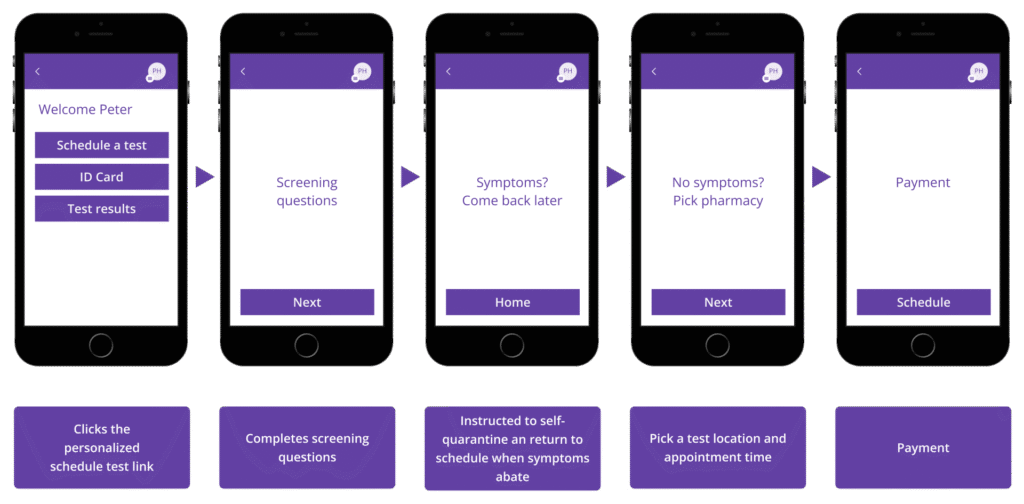
Conversations helped to discover other actors that were involved in the project. The Immunization Information system, PrepMod, VaccineFinder, Commercial insurances. This map needed modifications after the public launch. We didn’t considered States nor dependants in the first iteration.
Framing the service
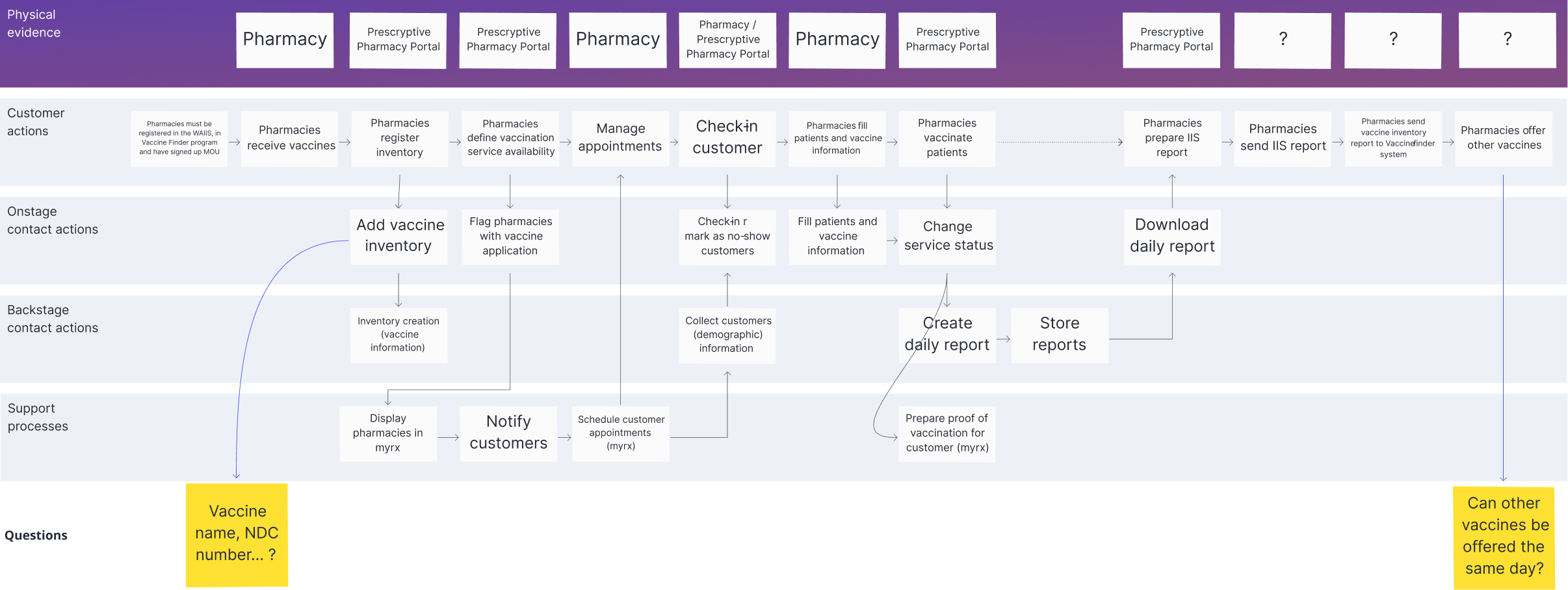
I was mainly focused on the desktop and the mobile app. However, I was also interested in understanding the process around. That situation encourage me to see the experience as a service. I used service blueprints to map the experience beyond both apps.

Adopting Material UI (MUI)
Using Material UI allowed the team to create interfaces in less time. From the design point of view It has different
Platform public launch
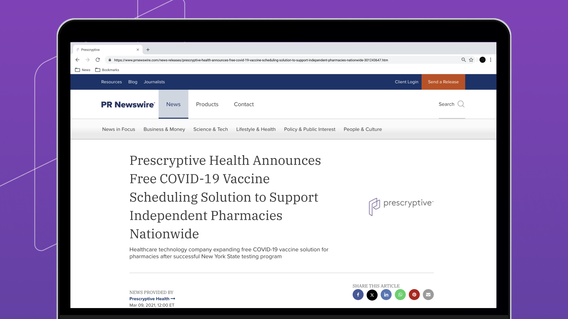
In December 2020, Prescryptive partnered with the New York State government to provide COVID-19 testing at no cost for its residents using the platform. A month later, vaccine appointments were included.
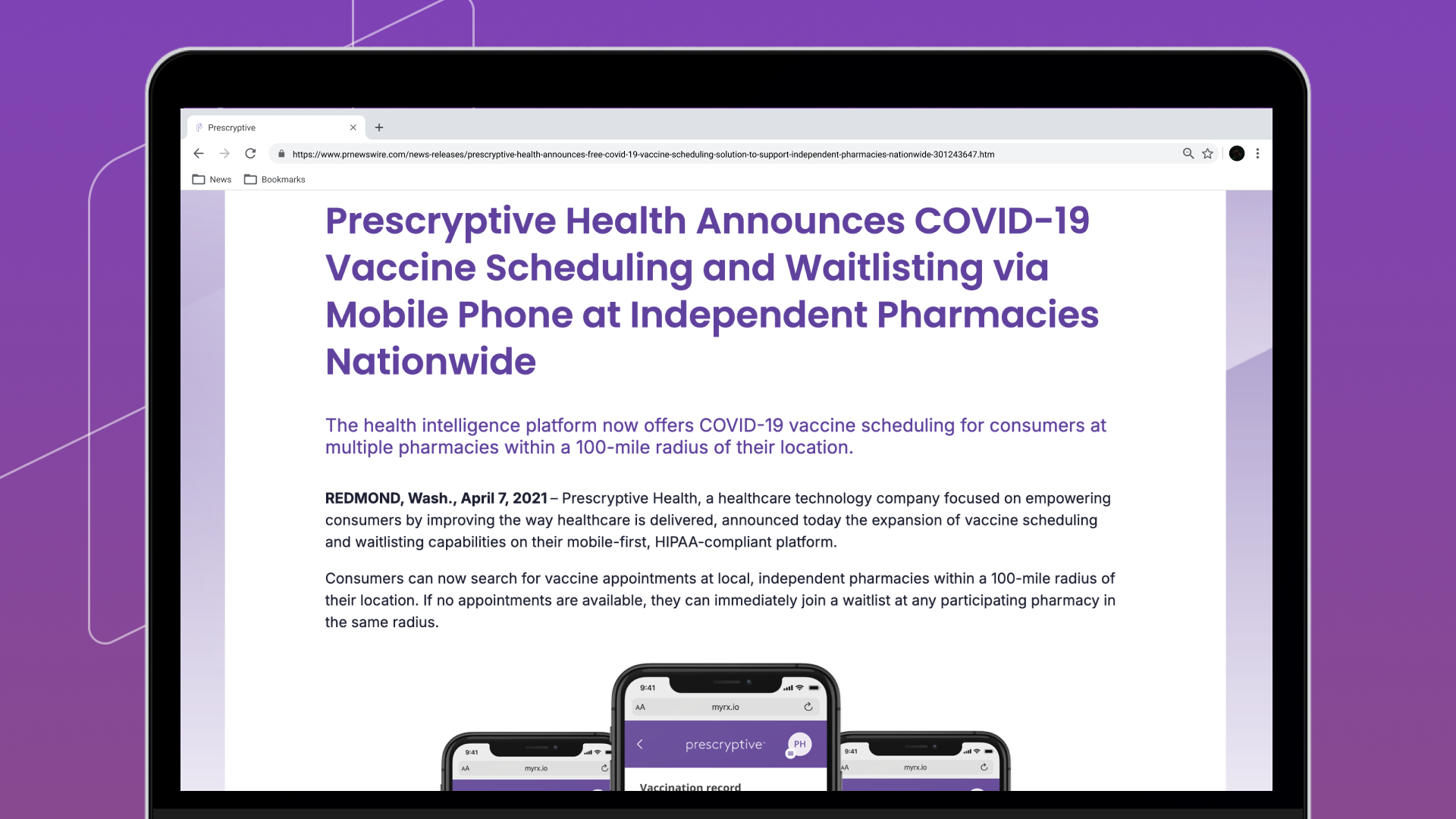
After launching, the main focus was to refine the experience and improve its usability. Additionally, new partnerships with other states created new business rules.
Takeaways
This project was one of the most fascinating for me. Given my background, I was unfamiliar with the American healthcare system, which posed a significant initial barrier. However, it gave me insight into the system’s federal and state-level operations.
Furthermore, being the only designer at the start of the project presented another major challenge. I had to divide my time between defining certain features, designing them, and collaborating with the engineering team.
Check another project
Nametag app
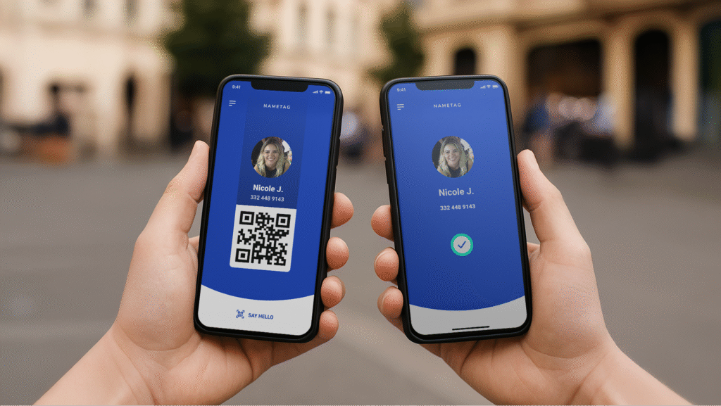
An iOS that allows users to control the data they share with businesses while businesses can verify customer identities.